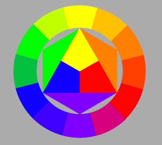
The 7 contrasts devised by Mr Itten are:
- Contrast of TONE
- Contrast of HUE
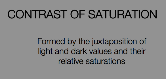
- Contrast of SATURATION
- Contrast of EXTENSION
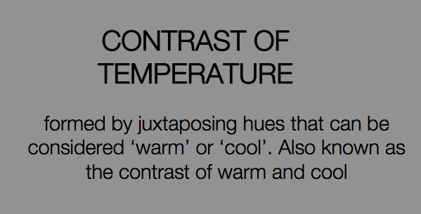
- Contrast of TEMPERATURE
- COMPLEMENTARY contrast
- SIMULTANEOUS contrast

The
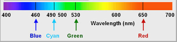
eye contains two kinds of receptors: rods and cones. While the rods convey
shades of gray, the cones allow the brain to perceive color hues. Of the three
types of cones, the first is sensitive to red-orange light, the second to green
light and the third to blue-violet light. When a single cone is stimulated, the
brain perceives the corresponding color. That is, if our green cones are
stimulated, we see "green". Or if our red-orange cones are
stimulated, we see "red". If both our green and red-orange cones are
simultaneously stimulated, our perception is yellow.The eye cannot differentiate between
spectral yellow, and some combination of red and green. The same effect
accounts for our perception of cyan, magenta, and the other in-between spectral
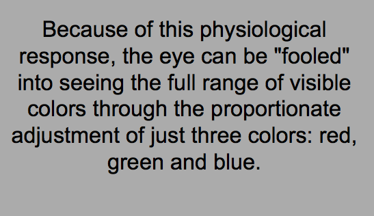
colors.Because of this physiological response,
the eye can be "fooled" into seeing the full range of visible colours
through the proportionate adjustment of just three colors: red, green and blue
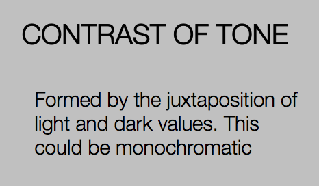
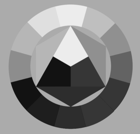
1. CONTRAST OF TONE
juxtaposition =
- an act or instance of placing close together or side by side , especially for comparison or contrast
- the state of being close together or side by side
tone =
- adding grey to a pure hue

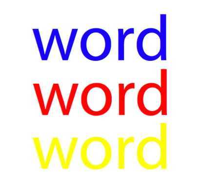
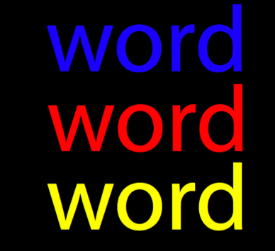
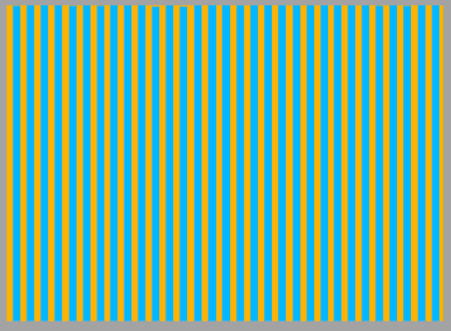
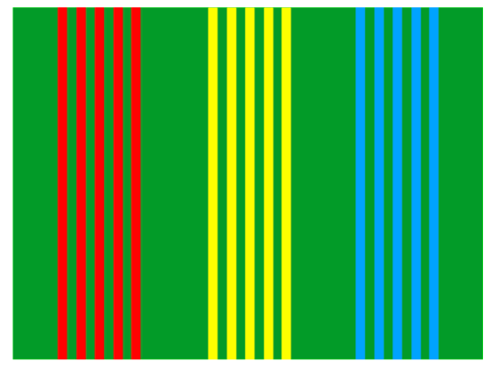
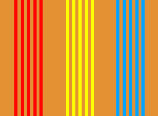
2. CONTRAST OF HUE
Different hues = different wavelengths of light. easy to distinguish between different hues.
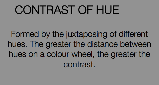

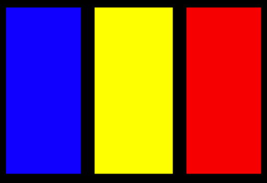
they contrast more against black

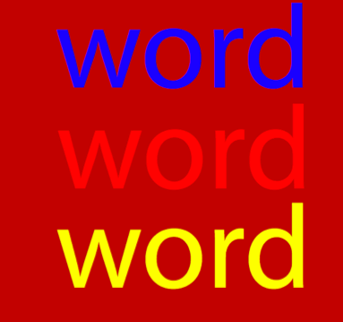
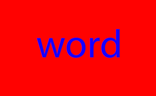
Here the red is the most difficult to read as the backgrounds a similar shade of red
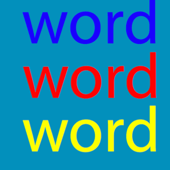
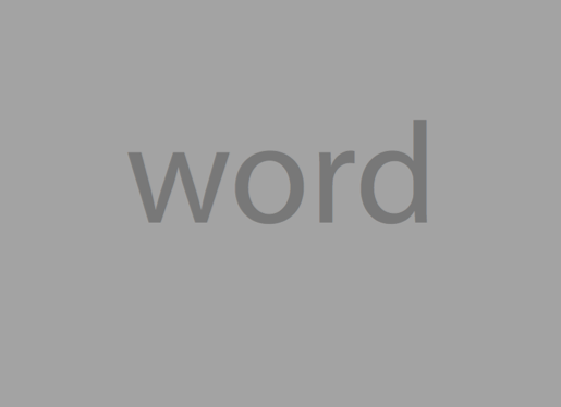
Here the blue is the most difficult to read as the backgrounds a similar shade of blue
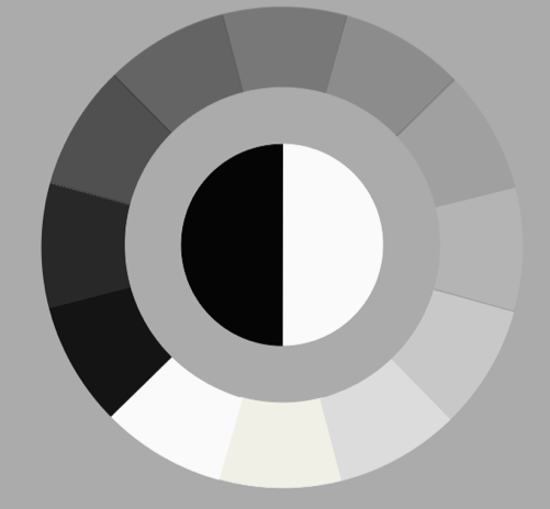
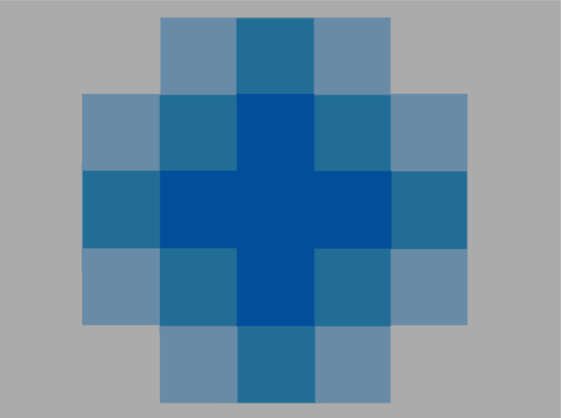
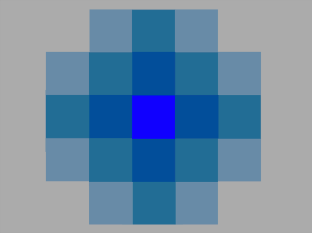
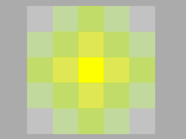
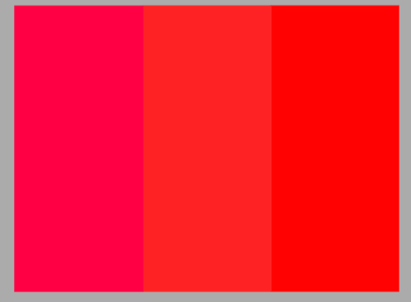
3. CONTRAST OF SATURATION
Saturation: Related to chromaticity, saturation tells us how a color looks under certain lighting conditions. For instance, a room painted a solid color will appear different at night than in daylight. Over the course of the day, although the color is the same, the saturation changes. This property of color can also be called intensity. Be careful not to think about SATURATION in terms of light and dark but rather in terms of pale or weak and pure or strong. www.colorcube.com


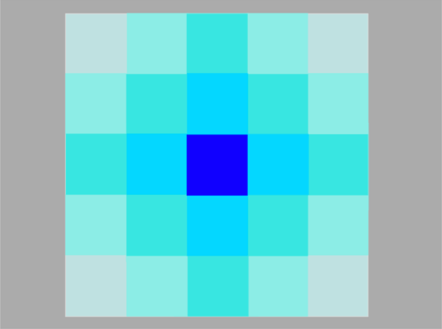
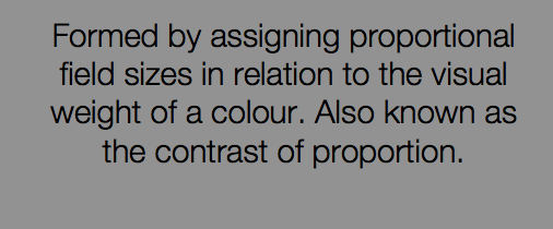
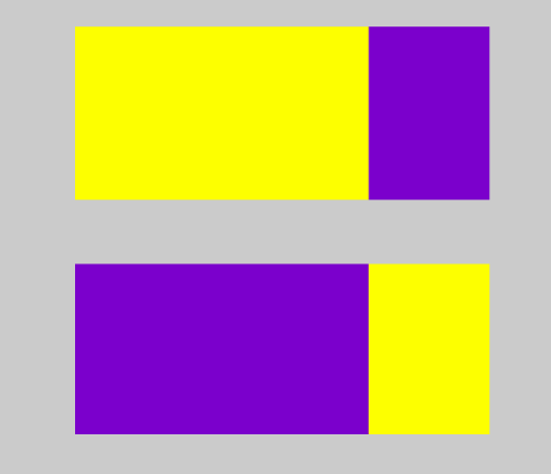
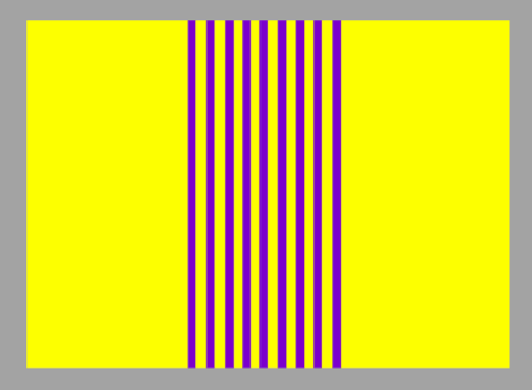
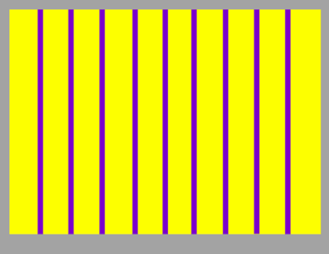
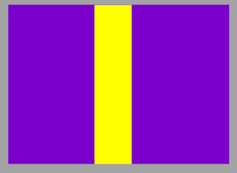
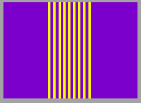
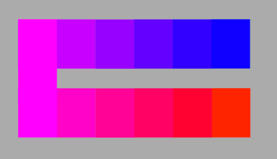
4. CONTRAST OF EXTENSION
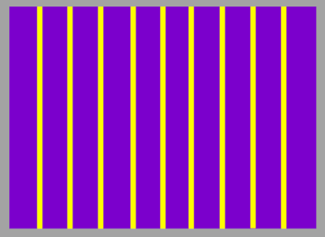
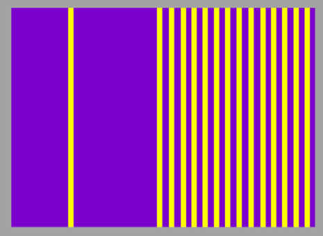
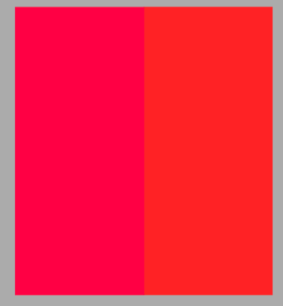
5. CONTRAST OF TEMPERATURE


6. COMPLEMENTARY CONTRAST

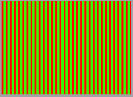
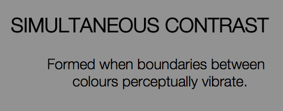
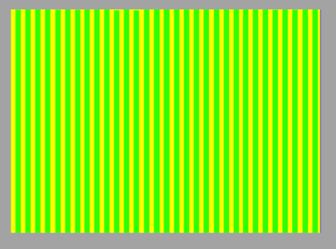
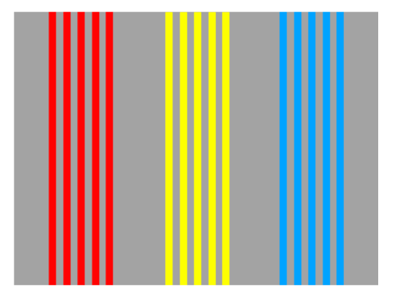
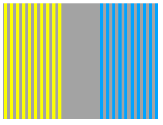
7. SIMULTANEOUS CONTRAST
0 comments:
Post a Comment